Welcome, my wonderful, genius, crafty pals!
I'm so incredibly glad you are joining me this week as I cover some basic color theory lessons, new mediums, and do it all while using some fabulous Unity Stamp Company floral stamps!
So what is color theory? In essence, it is getting to understand what colors belong together and when. If you're anything like me, you just throw things together that you think look good but are not really sure WHY they look good or why they look bad when they do. My friend, Annie Sterner, turned me on to thinking about why I choose the colors I do. She sent me a few videos and images that opened me up to new and different palettes I may not have chosen before.
Color theory is all about the color wheel. Check out this very simple one. The wheel shows you what you get when you mix basic colors. It shows you secondary colors (red+blue=violet), and tertiary colors (violet+blue= blue-violet).
The first color theory piece I'm going to talk about is complementary colors. Complementary colors are two colors that are directly across from one another on the color wheel. For example, violet and yellow are complementary colors. Violet is complementary to yellow because no yellow is added to make violet. Also, if you mix complementary colors, they make a kind of brown. So if your blue is ever too bright, you can always knock down some of the brightness and make it more neutral with a touch of orange.
For my example project using complementary colors, I used the kits, "You Are Forever Beautiful" by Angie Blom, and "Empowered Words" by Donna Downey. This floral is beautiful EVERY TIME someone colors it. Angie hit it out of the park with this beauty.
So why do these colors work together? I used the red rose and green stems because they are complementary. That is why red roses are so iconic! The red pops against the green foliage.
To get these luxe colors on my kraft background I used Vicki Boutin's art crayons. They are a cross between an oil pastel and a watercolor crayon. They give me the opacity I want on kraft, and they layer and blend nicely too. To use them, I scribble them on my craft mat, add a touch of water, and paint with them. They are so magical.
If you like the look of the red and green together, I suggest you try another complementary combo. Spring is here, so a purple and yellow would be fabulous together. Try a red violet and yellow green combination. Add a bit of contrast and make your own complementary color card! Then, share it on the Unity Show and Tell using the hashtag #colortheorywithShannon
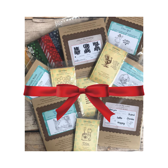
Please remember to comment below on my blog. Two winners who comment each of the five days will be selected to win a Unity prize package of 25 stamps! Seriously, it's a very generous prize.
Also, if you are not a member of Unity Show and Tell on Facebook, I highly recommend it. Crafters in the Show and Tell are experts, beginners, and everything in between. Plus, everyone is so kind and encouraging. No matter what stage you are at in stamping, you can post and feel accepted.
If you would like to follow me on Instagram, my handle is @shannon.edwards. You will be able to see a whole lot of Unity made goodness over there as well!


